

User Research
Workshops and Brainstorms
Sketches
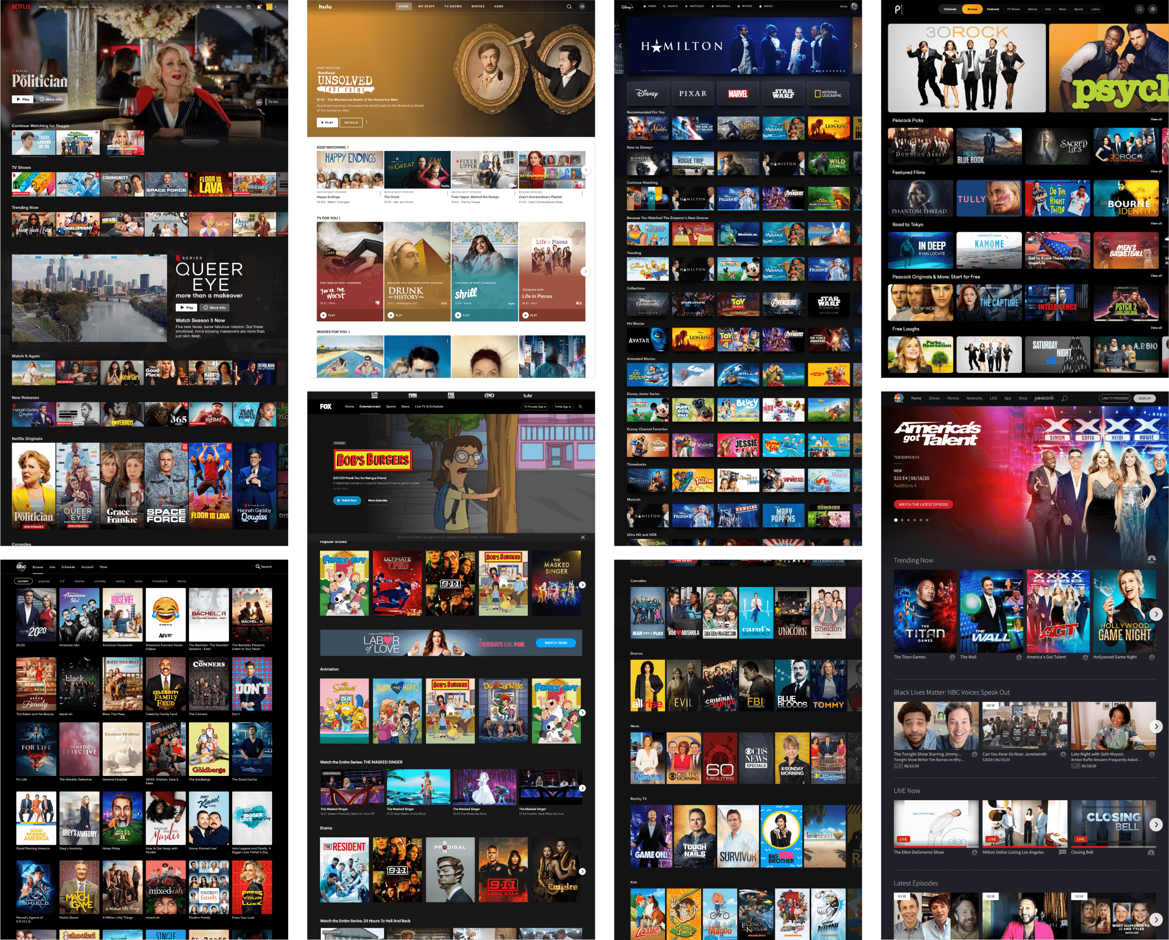
Competitive Scan
Wireframes and Visual Designs
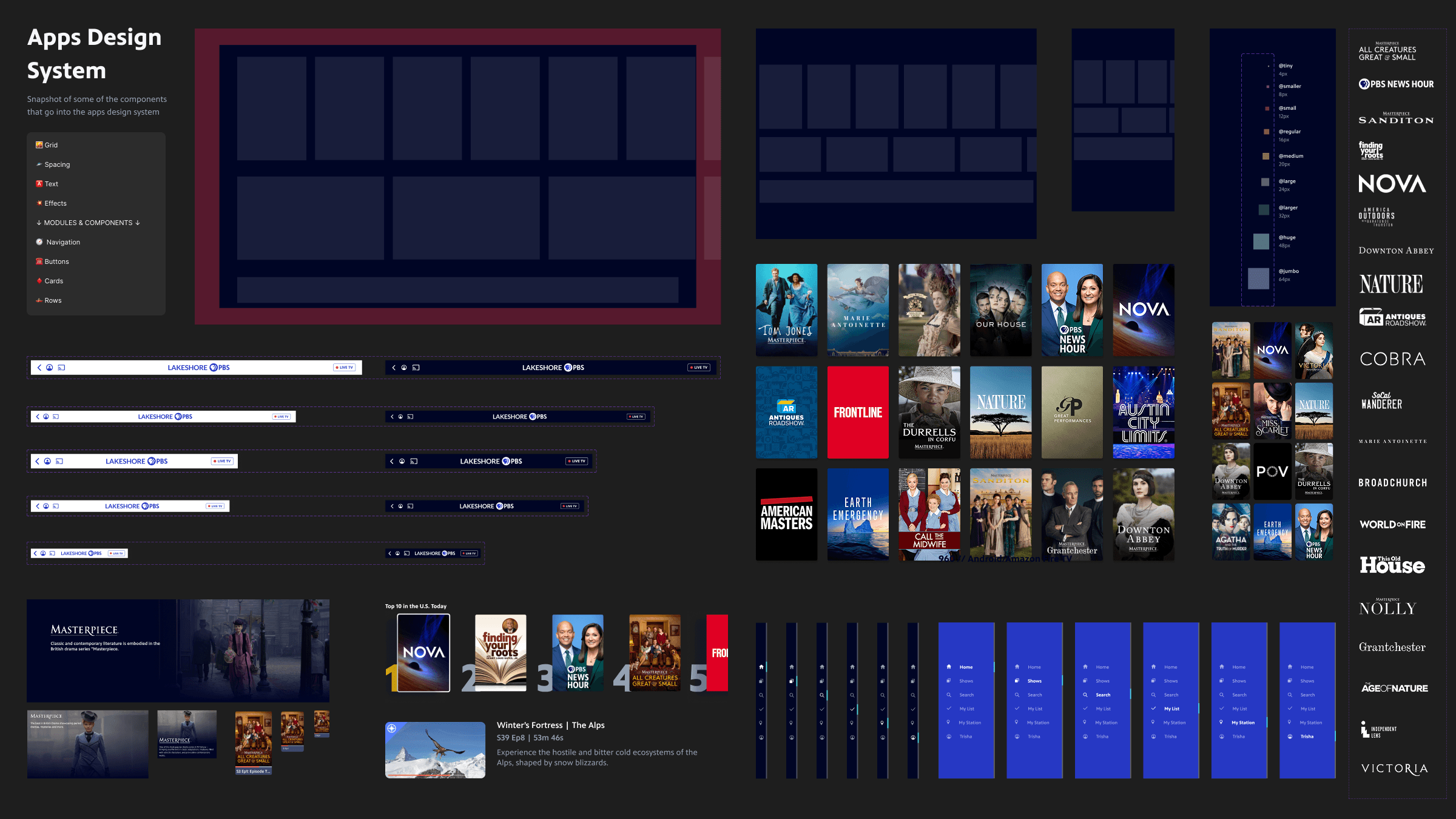
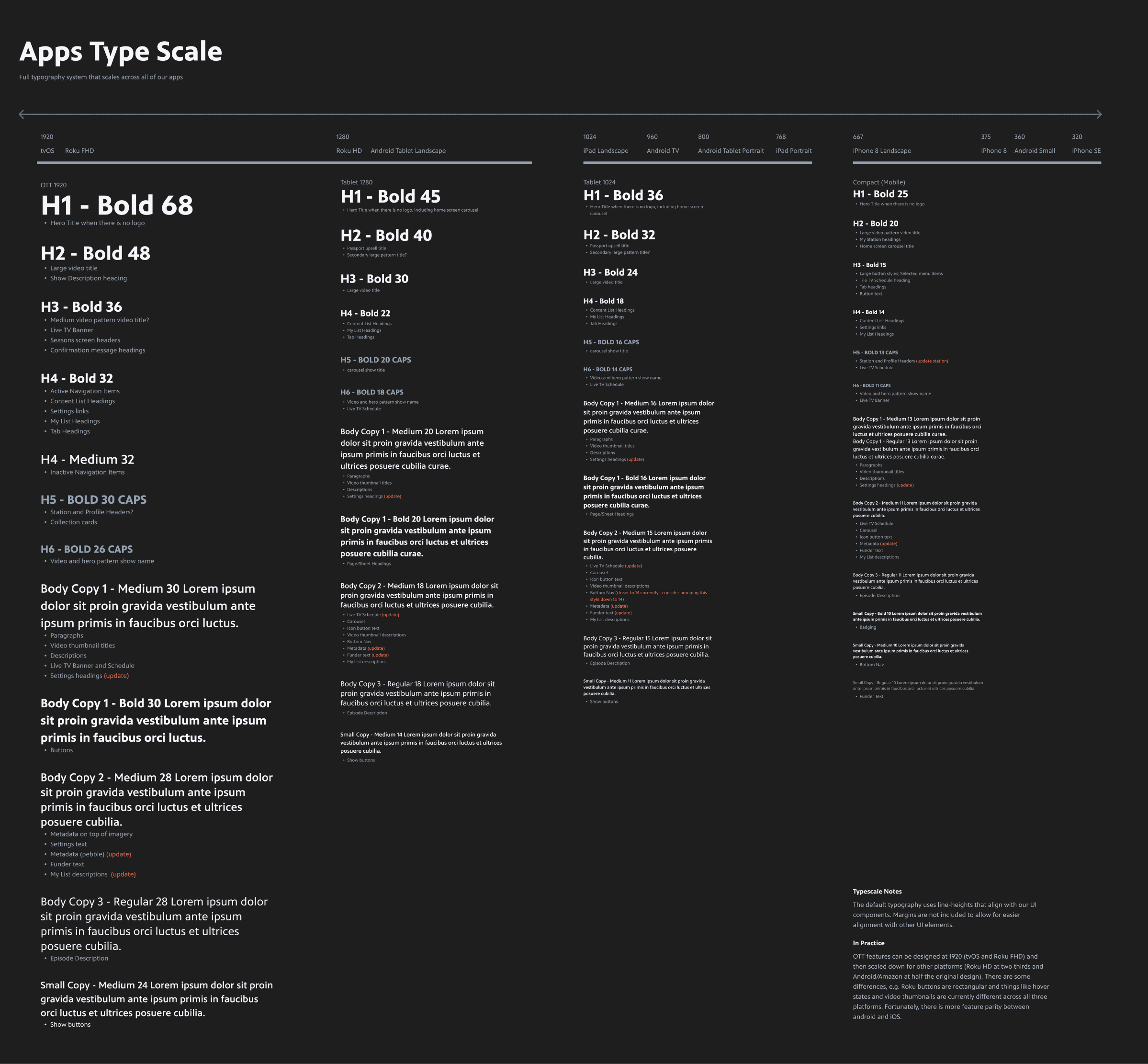
Design Systems
High Fidelity Prototypes
Design Tools
Figma
UserTesting.com
Google Analytics
JIRA
Github
Microsoft Suite
Background
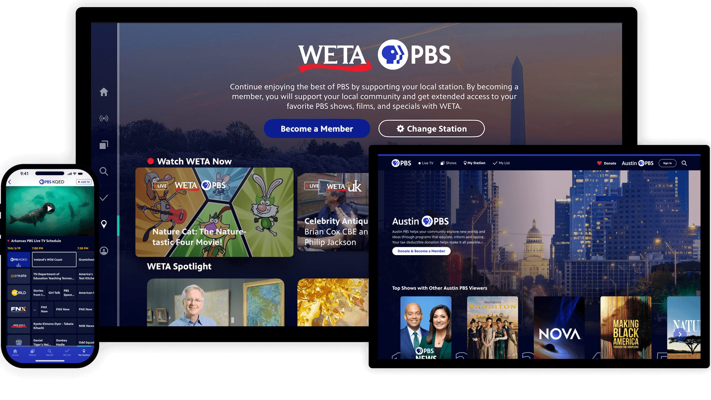
PBS.org and the PBS app get over 30 million visits per month and over 300 million general audience content streams per year. Over the past decade, streaming habits have changed drastically and users expect more on-demand convenience, personalized discovery, and seamless viewing across devices. As a media organization, PBS needed to adapt to these changes to meet viewer streaming demands.
Initially, the project was focused on updating the PBS.org codebase. Eventually, the modernized redesign of the site sparked so much excitement in the organization that we also harnessed buy-in for improving our PBS apps across TV and mobile. The latter was a good design challenge because of the many restrictions on what we can do across platforms like Apple, Android, and Roku.
The Opportunity
I led the design team in modernizing the PBS video streaming experience across web and app platforms. Challenges included:
Users struggled with navigation, content discovery, and outdated visuals. A full redesign was necessary to create a modern, engaging, and scalable experience.
With stakeholders spanning dozens of teams and hundreds of local stations, alignment was a key challenge.
As a membership based organization, we have a wide variety of differently-sized and -resourced stations. One station may have hundreds of employees while another might have three. This means we needed solutions that would cover stations who would want to update their content daily and those who would not regularly update their content.
As a nonprofit, we have limited resources, meaning we had to be strategic and lean in our approach.
Roles & Responsibilities
My Role
Leadership & Strategy
As the Senior Director of Design at PBS, I guided the strategy, collaboration, and execution of this redesign work—ensuring we delivered a streamlined, scalable user experience that serves PBS audiences, stations, and internal stakeholders. I collaborated closely with my team and others on a daily basis on designs, usability testing, and documentation. I also helped generate alignment to ensure broader buy-in.
Hands-On Design
The smaller size of this project team allowed me to design complex parts of the website and apps, including:
A new way of browsing shows to boost content discovery. Our previous product designs assumed most users knew what they were looking for, leaving valuable content buried.
A new navigation to increase the visual prominence of donation and streamline way-finding.
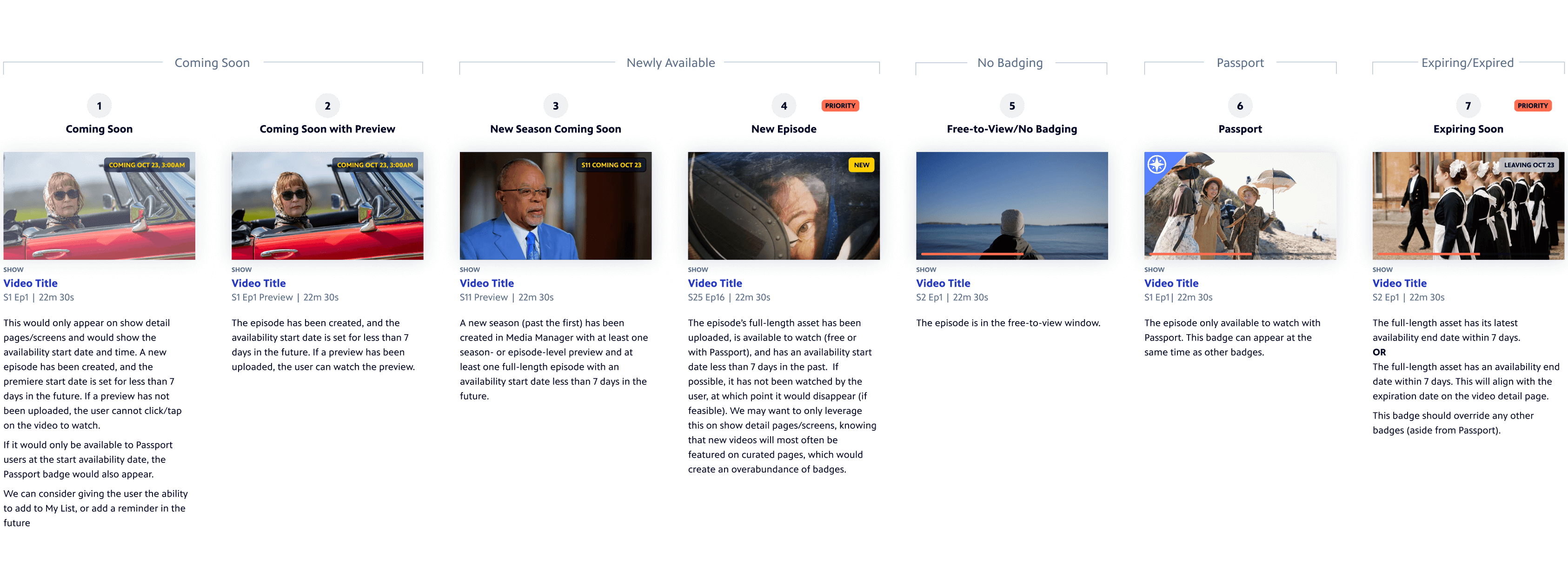
Logic for a new set of show and video badges to help users easily identify content that is new or leaving soon. This will solve user confusion about content availability while reducing support inquiries.
Collaborators
My closest partners in this project were Design Director Laura King and Associate Designer Grace Forster. We had support from other members of my team, including UX Director Amy Rubino and Motion Designer Kira Fleury. I also worked with teams across the PBS ecosystem, including product management, engineering, marketing, video strategy, station services, and representatives from our PBS stations all over the U.S.
27%
4.9
30M+
Design Process
🔍 Discovery
After initial meetings between design, engineering, and product management, I led the design team in facilitating discovery activities to learn more about stakeholder needs:
Station interviews around PBS.org and apps enhancements to better understand ourselves with station pain points and what was top of mind for them
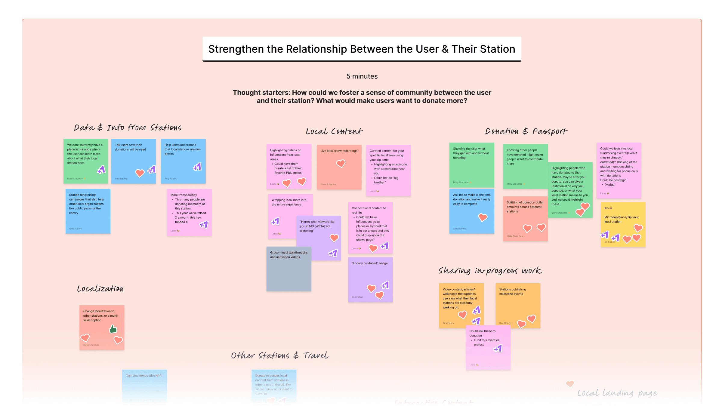
Internal team brainstorms to learn more about various teams’ needs and ideas
Competitive Scans for video streaming apps across web, mobile, and TV
Exploratory usability testing to learn what was and wasn’t working well about the existing products
Competitive Scan Snapshot
Brainstorm Snapshot
✏️ Definition
After our brainstorms, early sketch sessions, and research, I wanted the designers to work towards core goals as we embarked on this large scale redesign. Using documentation from the Discovery phase, I put together the following goals and shared them with the product team for input.
These goals became helpful throughout the entire process, not just for the designers, but also for aligning stakeholders across the system. A website redesign might initially appear superfluous for a nonprofit organization with limited resources; however, our organization leadership understood the value of improved content discovery, station presence, and user engagement.

💡Ideation
These activities helped us better understand where our focus should be as we ideated. I like to start large-scale redesigns with sketching (digital or analog) to allow us to generate many ideas quickly and avoid focusing on details. We’ll also leverage digital white-boarding tools so that we can collaborate in realtime. For this project, we took our sketches into Figma, shared, brainstormed, and then riffed off of each others’ ideas. Several of our early sketch ideas, such as dynamic video previews, later became core features.
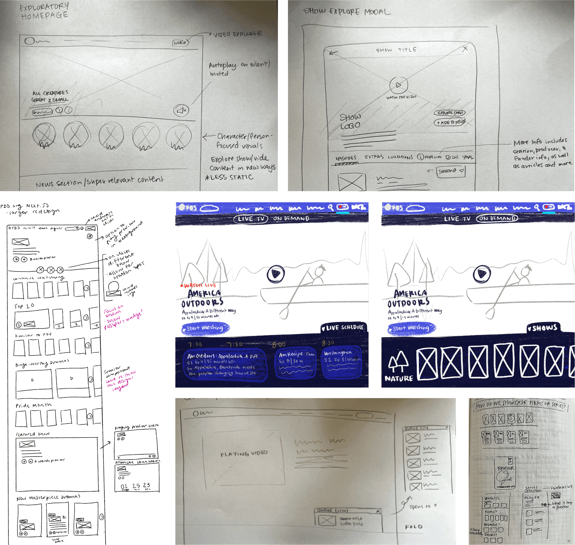
Over several weeks, two of my team members and I would come to our weekly meetings with new ideas. We would critique and build off of high-fidelity wireframes until we started fleshing out the initial designs of the reimagined pbs.org. In those first weeks, I encouraged blue sky thinking, knowing that the pbs.org website is our most flexible platform and this was our biggest opportunity for making significant UX and UI changes. We followed a similar, but compressed, process for apps explorations once it came time for that.
Throughout this process, we shared our work with the product manager and engineers. This served as gut checks and allowed early collaboration with our colleagues.
As the designs firmed up, we gave tailored presentations to key stakeholder groups, including organization leadership. These went smoothly because we took the time early on in the process to understand their goals and pain points. While we received constructive feedback that would only strengthen the designs, the most common questions were when we’d be able to get this work live on the web and when we’d be able to bring the improvements to our apps—both signs that stakeholders were happy with the designs.
🔨 Prototyping
Because our ideation phase quickly shifted from sketches to high-fidelity wireframes, the ideation phase also quickly bled into the prototyping phase. Some of our ideas benefited from clickable prototypes to help explain them to colleagues. These included new site navigation, a new playlist feature, and more. We leverage Figma for creating clickable prototypes and are continuously sharing new features and ways of using it amongst the team.

📋 Testing
User research leveraging usability testing, A/B testing, and Google Analytics allowed us to make thoughtful changes to our designs in a lean, iterative way.
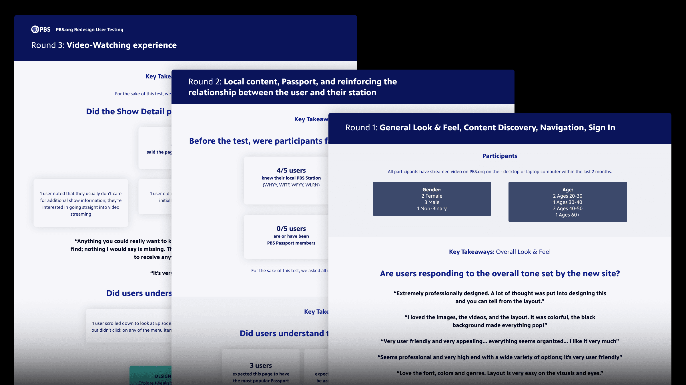
To validate our ideas, we put together three sets of usability tests for different parts of the website:
General look & feel, content discovery, navigation, sign in
Local content, Passport/membership, and reinforcing the relationship between the user and their station
Video-Watching experience, including Show, Video, and Genre Landing screens
I worked with the lead designer to guide what we wanted to test and how we should plan to execute and share the results. This was another learning opportunity for one of our visual/UI designers to learn more about usability testing, including when it is an appropriate tool, how to write thoughtful prompts, and how to pull insights into an engaging presentation.
The feedback from these tests allowed us to make quick changes to the designs and avoid usability issues on production.
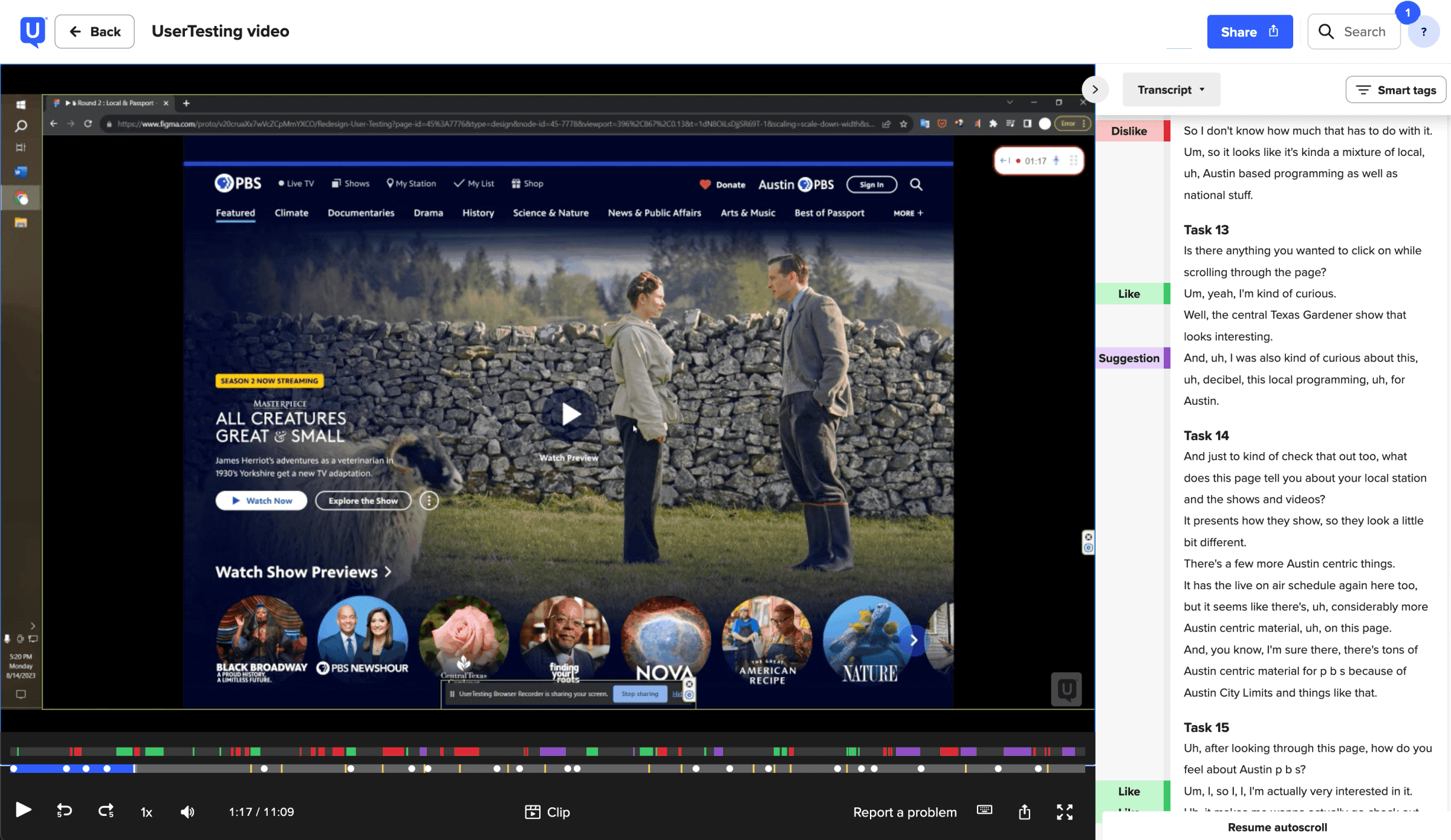
One thing that caught me by surprise over the past few years is how user expectations around autoplaying previews have changed. Five years prior to the redesign, most users found it annoying, but by the time we were working on the pbs.org redesign, most users expected and wanted it to help them discover new content.
Example Insights
6/6 users found autoplaying previews to be useful—a change from previous years.
Only 3/5 users understood our Passport badging, signaling a need for contextualization.
5/6 described the site as easy to use without being prompted. An early win!
📐 Implementation
After ensuring we had buy-in from stakeholders across the system, we started putting together the finalized, dev-ready designs. These included different breakpoints, considerations like hover effects, and a full design system that we will continue using as a starting point for new designs moving forward.
We accounted for as many details as possible, but one of the many benefits of working so closely with our engineers is that they can always reach out to us with questions. If anything was a particularly heavy lift, we could also discuss how we might tweak the design to achieve our same goals in a way that is more efficient to build. As the engineers worked through different parts of the redesign, they would share their in-progress work with us to get quick feedback before publishing.
When it came time to publish the site, we also implemented an onboarding modal with beautiful animations designed by our motion designer.
Features
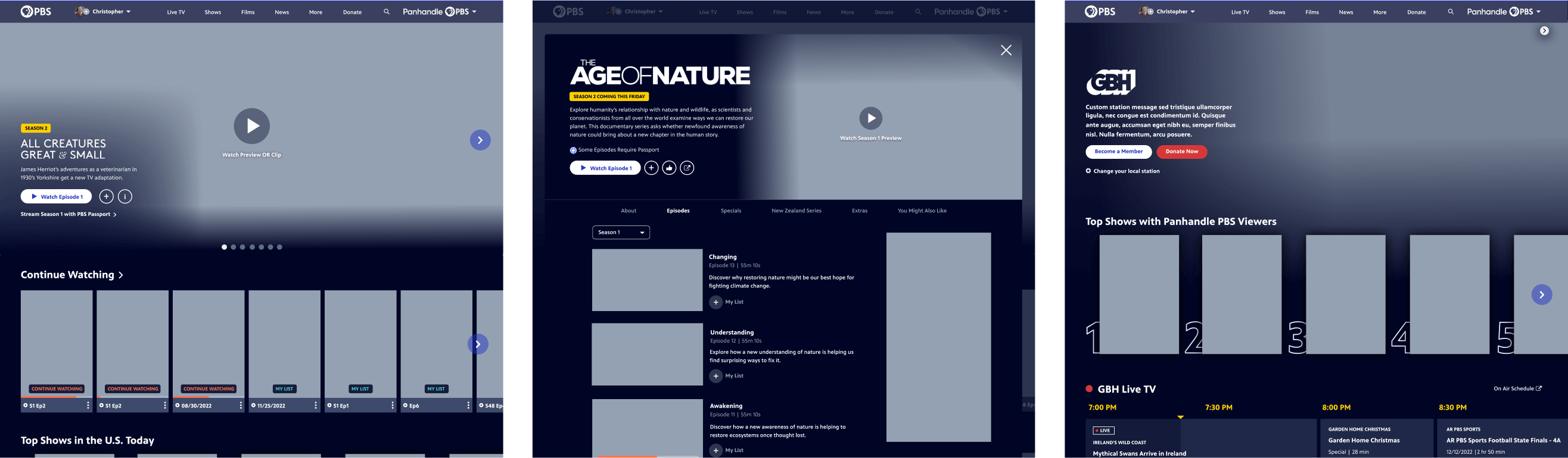
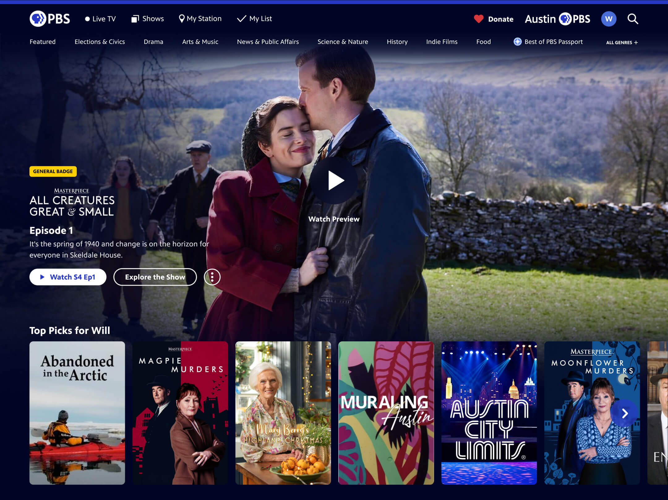
Enhanced Show Browsing Experience
Previously, our products were designed for catch-up viewing. We expected users to know exactly what they want to watch when they visit PBS on the web or apps. The new way to browse shows helps users discover new content with ease. I guided the experience design so that the user can easily get a taste of our content in the best way we can at PBS—via video. Selecting a show poster on PBS.org and the mobile app opens a modal that automatically plays a video preview.
Focusing on a show poster on the TV app dynamically updates the hero area of the screen to do the same thing. We also added features to user settings to disable this behavior for viewers who do not want it.
The show detail screens also include a new tabbed layout, making it more intuitive to drill into seasons and more.
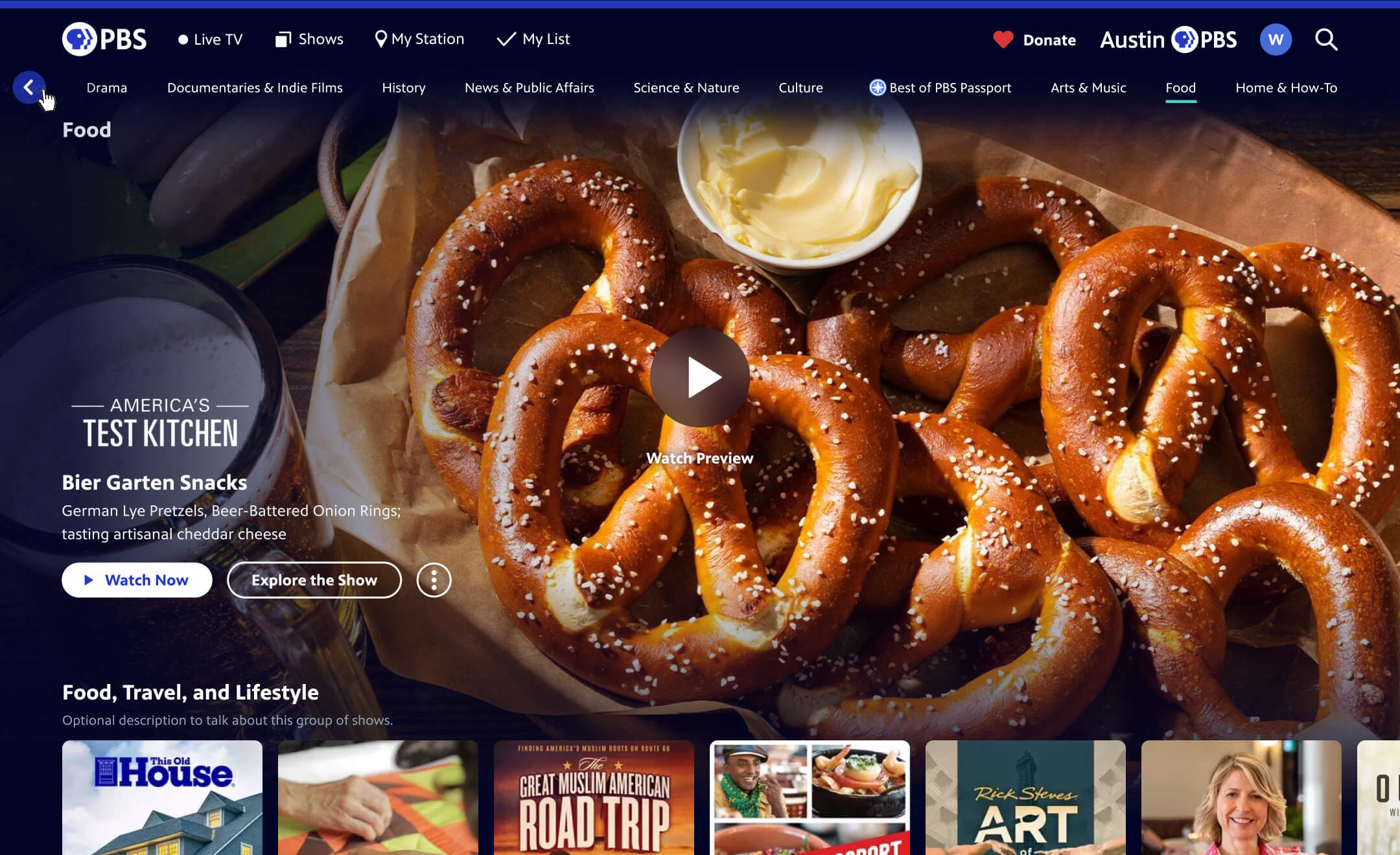
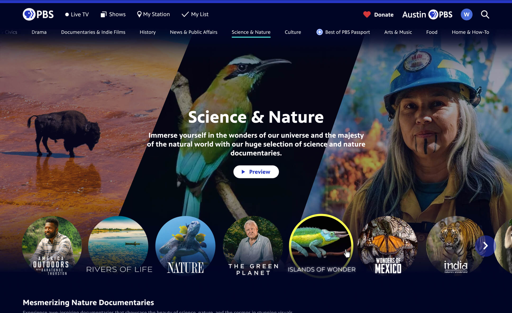
Improved Navigation, Including Genres
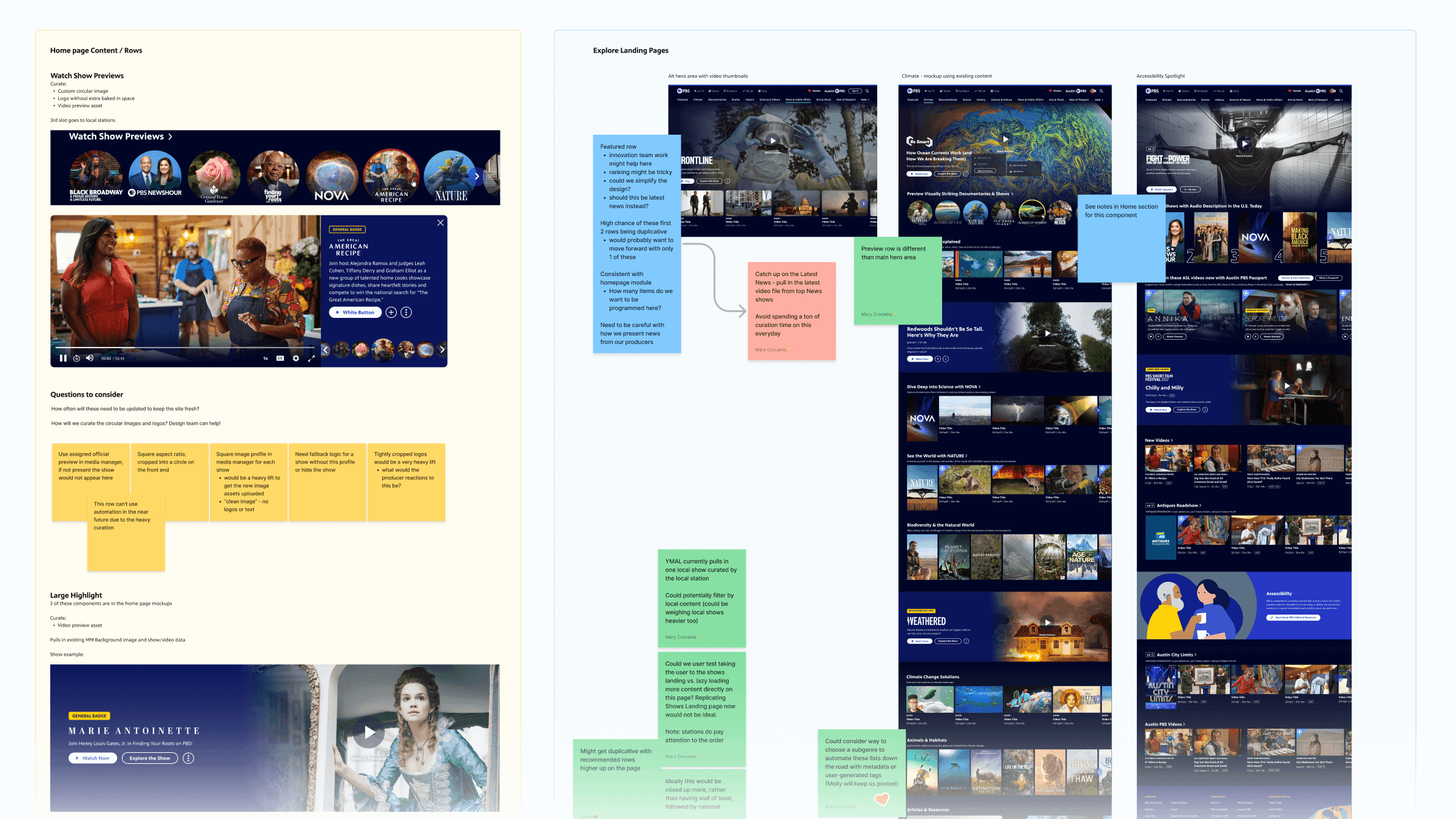
In the years leading up to the redesign, we worked with our marketing and content teams to create a new page type on PBS.org. What we called genre or topic pages allow users to discover new PBS content curated based on genres like Drama and Our Planet. As these expanded, we began referring to them as “explore hubs,” with the intention that they would be available across platforms.
Because various teams spend effort editorializing these and they are a success with our users, I advocated for incorporating them into the product navigation. That way, users can quickly see the breadth that PBS covers and also more easily discover new content.
In addition to this change, I also streamlined the navigation to bump the popular Live TV up in prominence and to put more emphasis on “Donate,” including a heart to reinforce that donating to your local station is something you can feel good about!
Increased Local Presence
Something that differentiates PBS from other video streaming platforms is that it is comprised of hundreds of local member stations all over the U.S. Visiting PBS.org or the PBS app gives you the opportunity to see content produced within your community. This benefits PBS overall because it helps users understand the value their local station brings. Increased affinity for the station means more people becoming members by donating to their local station. One of our primary design goals was to increase station presence and we did this through several new and improved features:
A new My Station section, showcasing locally-curated content
Top 10 rows of content based on your area/station
Multiple local live TV channels
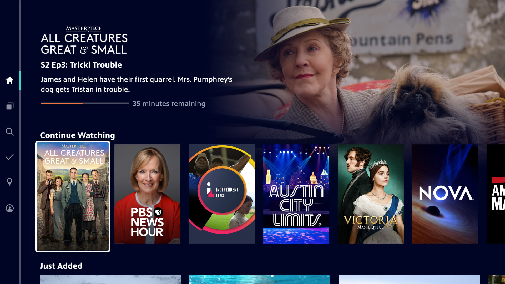
Personalization
We also designed recommended rows of content across our platforms to help create a more personalized experience for logged-in users. This was in partnership with our innovation team, who research and develop new technologies for us to better understand and explore in our products. We are working across teams to generate enhanced metadata to improve our algorithms. Early analytics showed a marked increase in content engagement for these personalized rows.
Continue Watching Functionality
Most of our products either had no continue watching behavior, or only the ability to pick up mid-episode. Users had to manually search for where they left off if they had finished an entire episode in a series, leading to frustration. I noticed that this missing feature became one of the most common user complaints in our apps reviews. I shared samples of these reviews, along with a competitive scan, with my colleagues to advocate for us to add this feature into our roadmap. Finally, we introduced a Continue Watching row that saves progress across devices, no matter where the user left off.
The new Continue Watching row quickly became the content row that users interacted with the most. By balancing user needs with technical constraints, we delivered a frictionless feature that increased retention and improved the overall viewing journey.
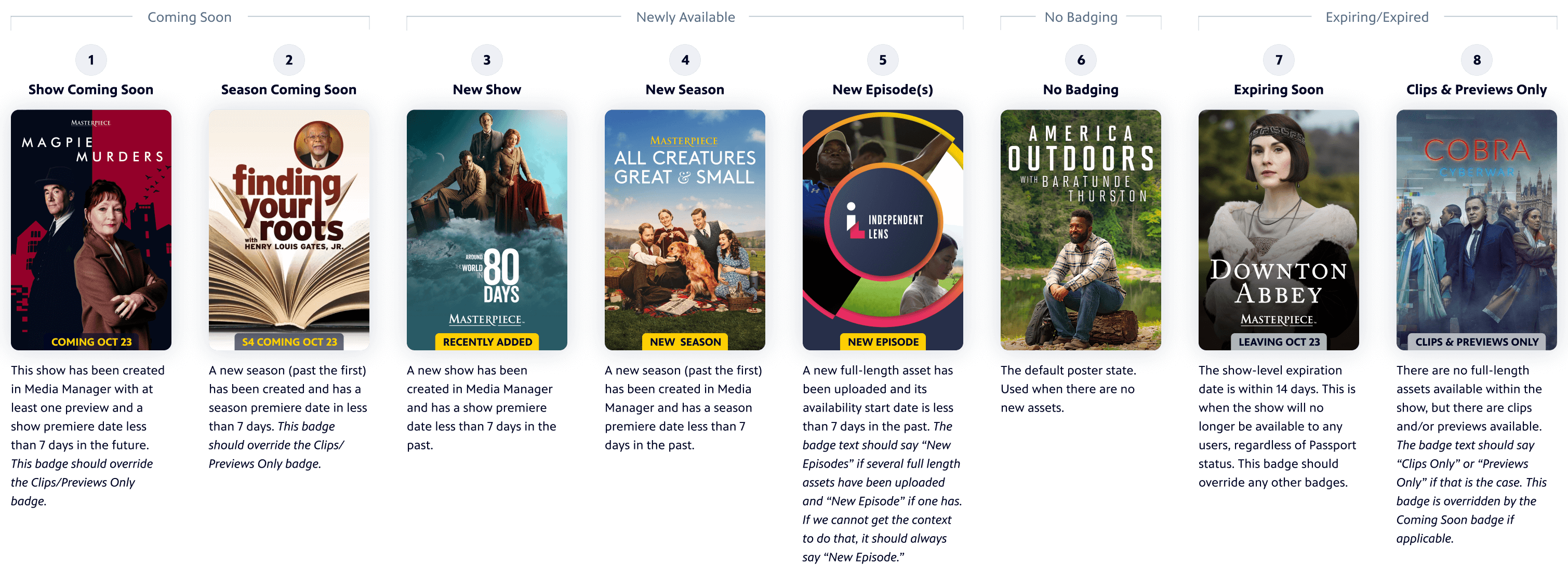
Show and Video Badging
To enhance content discovery I outlined logic and a design system for badges that quickly communicate key details such as new, expiring, or member-exclusive content. I presented these and led stakeholder alignment to ensure consistent functionality across platforms.
Live TV Experience
Before the entire redesign of PBS.org or the apps were launched, we started by launching multiple livestream channels. After launching our first livestream, it quickly became the most popular content type on our platforms. This also aligned with industry trends as SVOD channel subscriptions declined. For this reason, we not only added more channels, including local station channels, but we also increased the prominence in the navigation.
In addition to these features, the entire products got a new look and feel, modernizing the experience overall and making viewers more likely to come back to watch.
Reflection
Impact
Our redesign approach led to improved communication across teams and increased internal support for user-centered design, with leadership recognizing it as a model for future PBS product improvements. The success and system-wide acclaim for the PBS.org redesign resulted in leadership pushing for similar design updates to our apps.
The digital PBS video-watching experience became smoother with improved ways to discover new content to watch. The impact is already clear on pbs.org and we are expecting the same once we’re able to release these improvements to our apps.
Lessons Learned and Next Steps
While the pbs.org redesign allowed for a full site refresh, the lengthy process reinforced the value of delivering iterative improvements to viewers sooner.
These projects also remind me that much of the change we want to make to our product experiences requires work from so many teams across the organization. It just serves as another reminder of why it is beneficial to avoid working in siloes. We also learned the importance of identifying roles and responsibilities early, especially when it came time to shift from design to development. The project similarly reinforced value of bringing people in early to help provide focus and buy-in (and frankly made the project much more fun).